Versions Compared

Key

  • This line was added.
  • This line was removed.
  • Formatting was changed.
UI Text Box
sizemedium
typeinfo

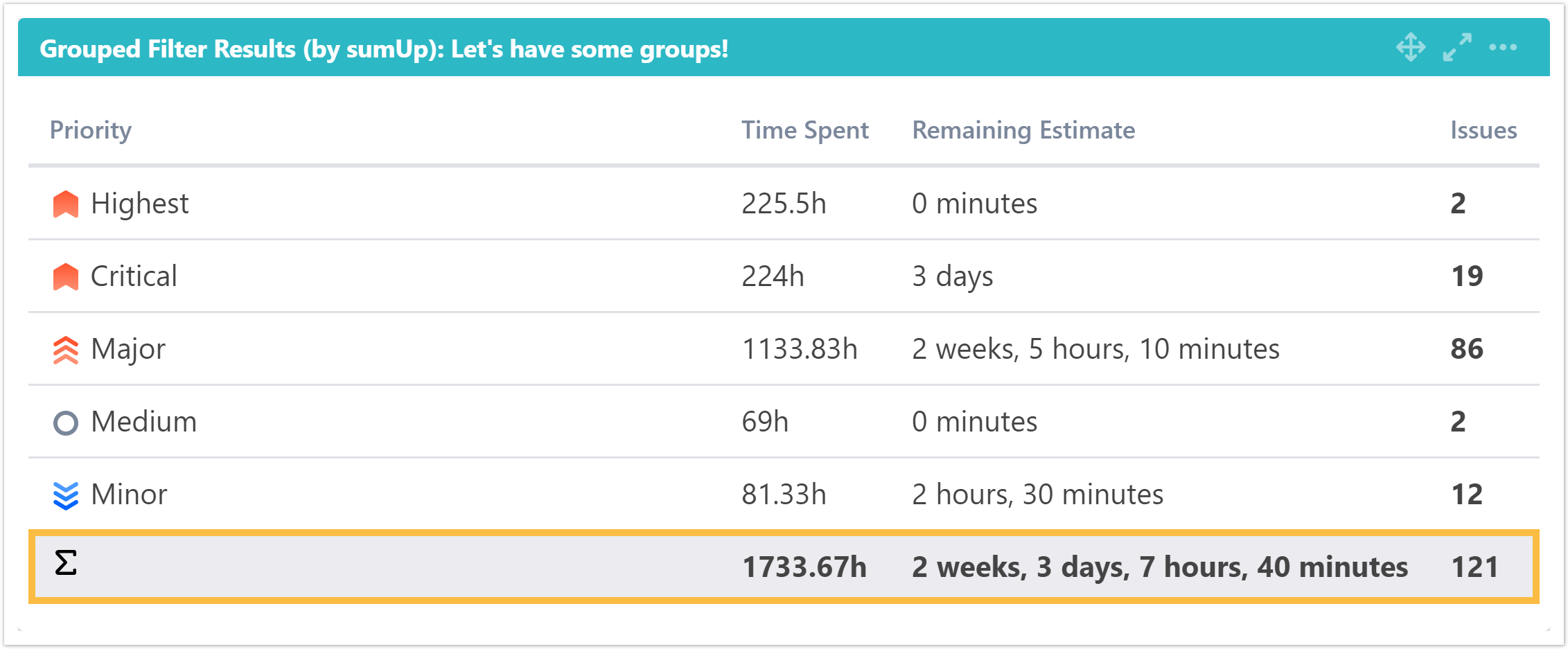
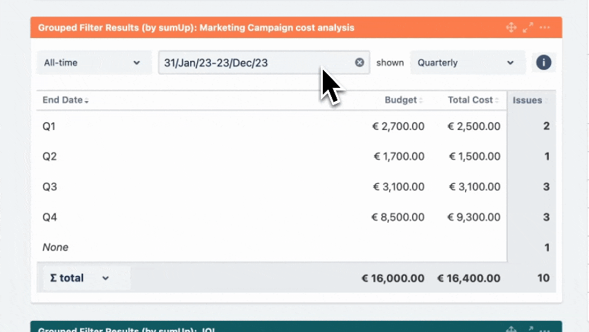
What does this gadget offer?

The Grouped Filter Results gadget can be used to calculate calculates sums of multiple fields while the source issues are grouped by one custom field.

Image Removed

Image Added


Configuration

UI Expand
titleGadget TitleWhat is the name of your gadget?

Add a custom title to the gadget for easier identification. If nothing is set, the title will be generated by combining the gadget name and the selected filter/ JQL.

UI Expand
titleIssue filterWhich issues do you want to analyze?

Select whether you want to use a predefined JQL Filter or a custom JQL to get the issues.

UI Expand
titleFields Which fields would you like to display?

Add fields to be displayed as columns and reorder them using drag and drop.

UI Text Box
typenote

The sum/ average of a field will only be displayed, if a calculation rule has been created.

Excerpt Include
Filter Results gadget (by sumUp)
nopaneltrue

UI Expand
titleGroup ByHow do you want to group the results?

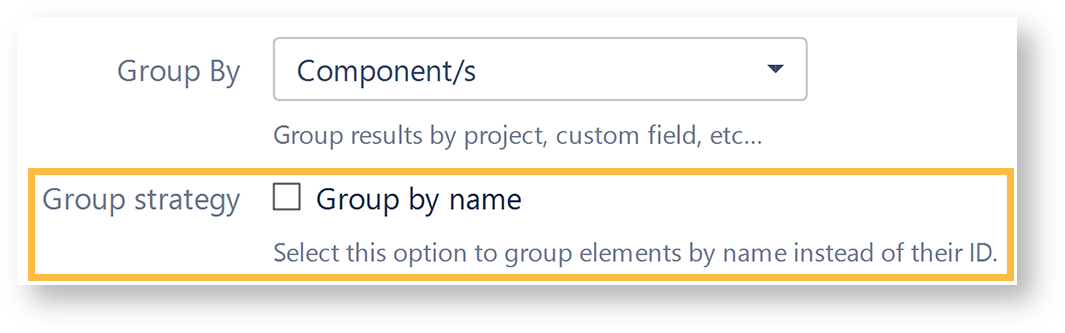
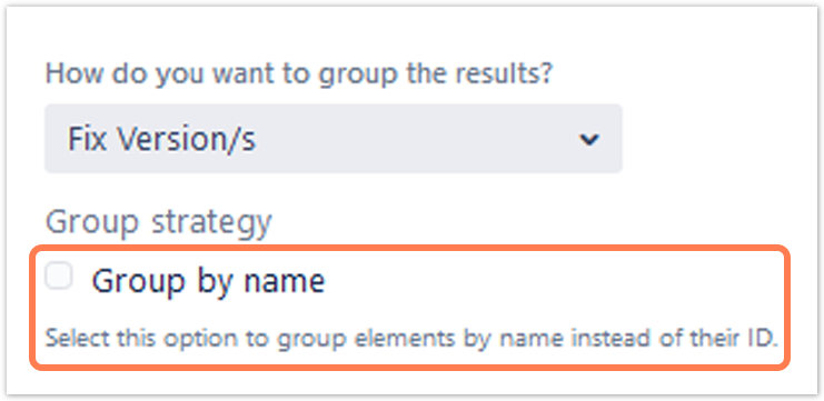
Select a field that will be used to group the results on the Y-axis.

UI Text Box
typeinfo

Grouping by name instead by ID

Status
colourYellow
titlesince version 3.6.0

When selecting one of the following fields, it is possible to group by their name instead of the ID:

  • Version fields (Affected version, Fix version)
  • Components field
  • Option select custom fields


By default, the values will be grouped by their ID, meaning that there might be several options that have the same name (e.g. 2 components from different projects) but since they don't have the same ID in the database, they will be treated as two different values.

When checking the checkbox, options with the same value will be treated as one option, even though they are saved as different values in the database.Image Removed

Image Added

UI Expand
titleNumber of ResultsHow many rows do you want to display per page?

Choose how many results you want to display on your dashboard.

UI Expand
titleWhich time period do you want to display as default?

Status
colourYellow
titlesince version 3.8.0

If you have chosen to group the data by a date (e.g. Due date), you can set a default time period for the displayed data when the gadget is loaded or refreshed.

You can choose between: 

  • Current week
  • Current month
  • Current quarter
  • Current year
  • All-time
UI Expand
titleWhich default for the date aggregation level do you choose?

Status
colourYellow
titlesince version 3.8.0

If you have chosen to group the data by a date (e.g. Due date), you can set a default aggregation level for the displayed data when the gadget is loaded or refreshed.

You can choose between:

  • Daily
  • Weekly
  • Monthly
  • Quarterly
  • Yearly
UI Expand
titleRefresh Interval

Specify how often the gadget should be refreshed.

You can choose between: 

  • Never

  • Every15 Minutes

  • Every 30 Minutes

  • Every 1 Hour

  • Every 2 Hours

Info

If Never is selected, the gadget will only be refreshed on page reload.

View mode Image Added

UI Expand
titleSorting
The colums can be sorted by clicking on the small arrows next to each colum header. 
UI Expand
titleFilter bar

Status
colourYellow
titlesince version 3.8.0

UI Text Box
typenote

The gadget displays an additional filter at the top when a date field is selected in the configuration.

Initially, it is pre-populated with the value set in the configuration and the data is displayed accordingly. 

Image Added


Excerpt

Option

Description

Time period

The drop-down menu contains the options in the following order:

  • Current week
  • Current month
  • Current quarter
  • Current year
  • All-time

Date picker

UI Text Box
typetip

The picker allows you to override the Time period selection.

You can select the start and end dates of the aggregated data by clicking first on the start date and then on the end date.

Image Added

Info

To enter your chosen date, click next to the expanded calendar.

UI Text Box
typenote

If the date range is not customized, it reflects the chosen Time period. For example, the period selection would display 01/Jan/24-31/Dec/24 if the Current year option is selected. If the date range is adjusted, the Time period changes to Customized.

Date grouping

UI Text Box
typetip

The selector determines how the data is grouped in the columns/rows of the table.

The drop-down menu contains the following options:

  • Daily shown as separate dates. 
  • Weekly shown as W1, W2, W3,...
  • Monthly shown as M1, M2, M3,...
  • Quarterly shown as Q1, Q2, Q3, Q4
  • Yearly shown as Y/22, Y/23, Y/24, ...

If the data spans more than one year, the Weekly, Monthly and Quarterly data are shown with the year as suffix, e.g. Q1/24.

Info icon

The tooltip displays information about the data displayed in the gadget.


UI Expand
title∑/Ø total

Status
colourYellow
titlesince version 3.8.0

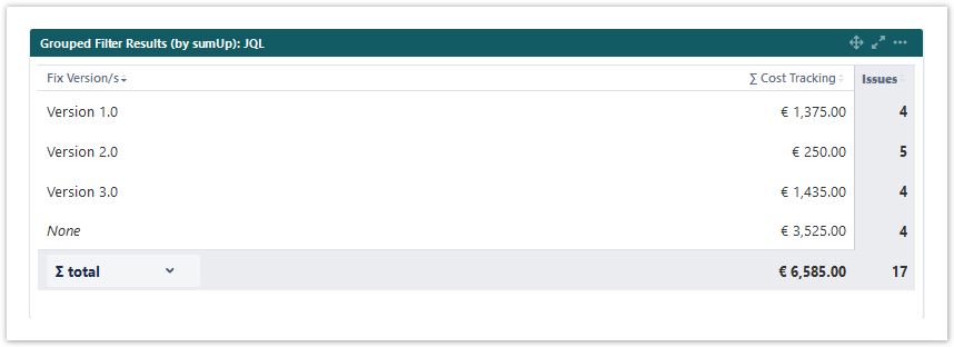
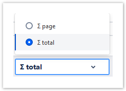
You can choose between theoverall ∑ total or thetotal of the ∑ page. Or you can choose between the Ø total or the Ø page, if you have selected average fields. 

Image Added


Image Added Use cases and examples

Page properties report
firstcolumnUse case
cqllabel = "grouped-filter-resuls" and space = currentSpace()


Excerpt Include
DECADIS:Contact support
nopaneltrue