Page History
| UI Text Box | ||||
|---|---|---|---|---|
| ||||
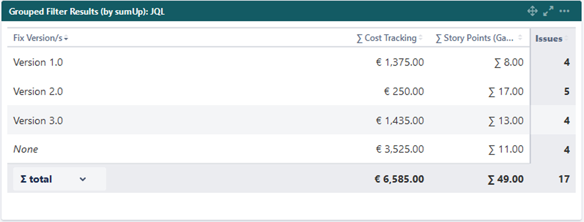
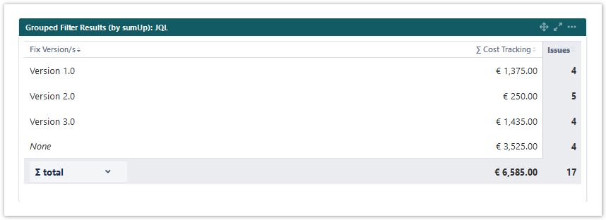
What does this gadget offer?The Grouped Filter Results gadget can be used to calculatecalculates sums of multiple fields while the source issues are grouped by one custom field. |
 Configuration
| UI Expand | ||
|---|---|---|
| ||
Add a custom title to the gadget for easier identification. If nothing is set, the title will be generated by combining the gadget name and the selected filter/ JQL. |
| UI Expand | ||
|---|---|---|
| ||
Select whether you want to use a predefined JQL Filter or a custom JQL to get the issues. |
| UI Expand | |||||||||||||
|---|---|---|---|---|---|---|---|---|---|---|---|---|---|
| |||||||||||||
Add fields to be displayed as columns and reorder them using drag and drop.
|
| UI Expand | |||||||||||
|---|---|---|---|---|---|---|---|---|---|---|---|
| |||||||||||
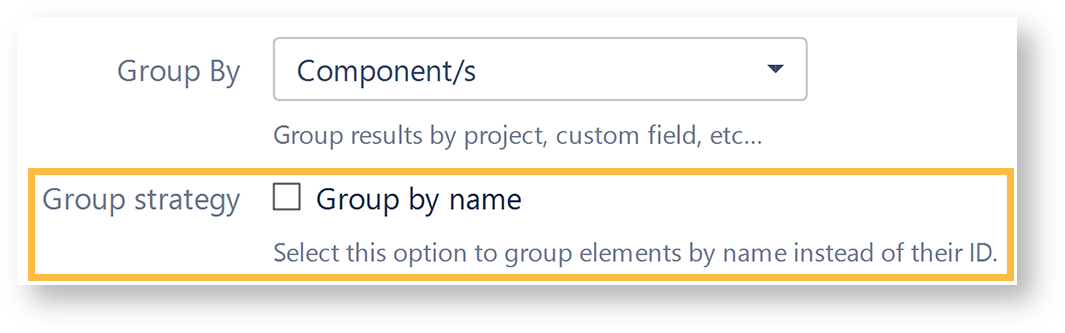
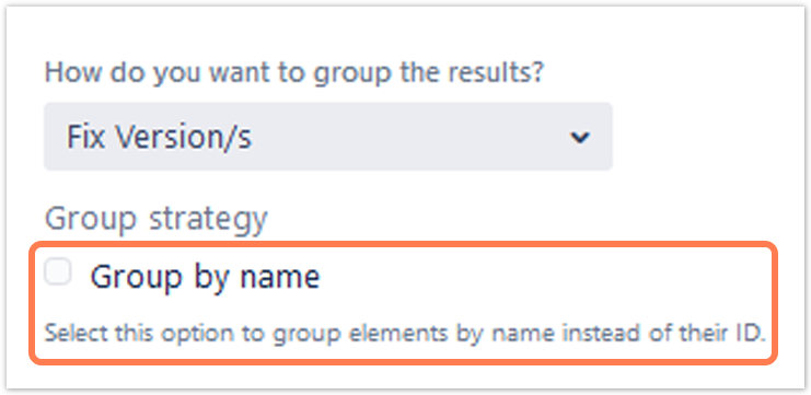
Select a field that will be used to group the results on the Y-axis.
|
| UI Expand | ||
|---|---|---|
| ||
Choose how many results you want to display on your dashboard. |
| UI Expand | ||||||
|---|---|---|---|---|---|---|
| ||||||
| Excerpt | ||||||
Option | Description |
| ||||
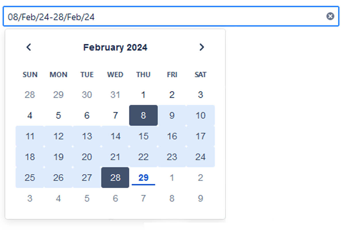
If you have chosen to group the data by a date or date time field(e.g. “Due date” or “Created”Due date), you can set a default time period for the displayed data when the gadget is loaded or refreshed. You can choose between:
|
| UI Expand | ||||||
|---|---|---|---|---|---|---|
| ||||||
If you have chosen to group the data by aa date or date time field(e.g. “Due date” or “Created”Due date), you can set a default time period for the displayed data when the gadget is loaded or refreshed.
|
| UI Expand | ||
|---|---|---|
| ||
You can choose between:
|
 View mode
| UI Expand | ||
|---|---|---|
| ||
| Note | | |
|
| UI Expand | ||||||||||||||||||||||||||||||||||||||||||||||||||||||||||||||||||||||
|---|---|---|---|---|---|---|---|---|---|---|---|---|---|---|---|---|---|---|---|---|---|---|---|---|---|---|---|---|---|---|---|---|---|---|---|---|---|---|---|---|---|---|---|---|---|---|---|---|---|---|---|---|---|---|---|---|---|---|---|---|---|---|---|---|---|---|---|---|---|---|
| ||||||||||||||||||||||||||||||||||||||||||||||||||||||||||||||||||||||
|

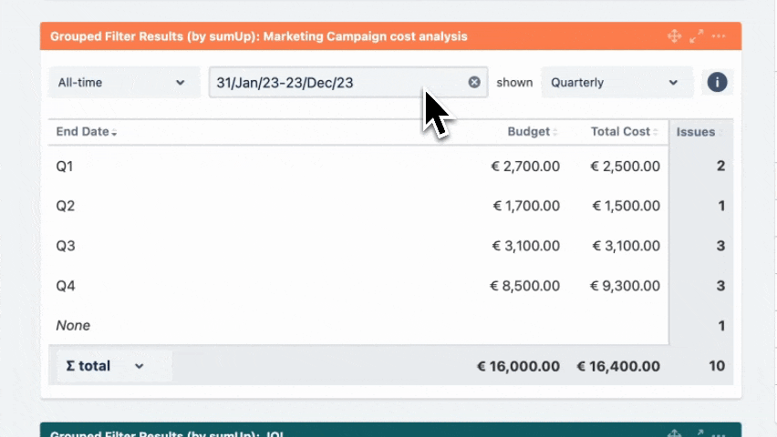
Initially, it is pre-populated with the value set in the configuration and the data is displayed accordingly. |

| Excerpt | ||||||||||||||||||||||||||||||||||||||||||||||||||||||||
|---|---|---|---|---|---|---|---|---|---|---|---|---|---|---|---|---|---|---|---|---|---|---|---|---|---|---|---|---|---|---|---|---|---|---|---|---|---|---|---|---|---|---|---|---|---|---|---|---|---|---|---|---|---|---|---|---|
Initially, it is pre-populated with the value set in the configuration and the data is displayed accordingly.
UI Text Box |
UI Text Box |
|
| UI Expand | ||||||
|---|---|---|---|---|---|---|
| ||||||
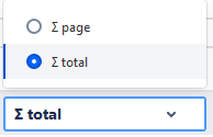
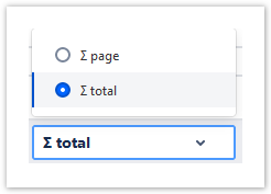
You can choose between theoverall ∑ total or thetotal of the ∑ page. Or you can choose between the Ø total or the Ø page, if you have selected average fields. |
 Use cases and examples
| Page properties report | ||
|---|---|---|
|
Related Use Cases
|
| Excerpt Include | ||||||
|---|---|---|---|---|---|---|
|