What does this gadget offer?
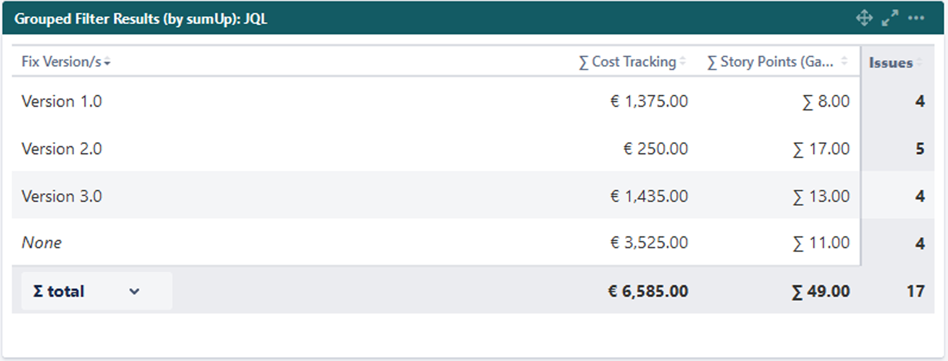
The Grouped Filter Results gadget can be used to calculate sums of multiple fields while the source issues are grouped by one custom field.
 Configuration
Add fields to be displayed as columns and reorder them using drag and drop.
The sum/ average of a field will only be displayed, if a calculation rule has been created.
If there are multiple calculation rules for a single field, they all are selectable from the dropdown list.
The field name will be written in parentheses behind the rule name.
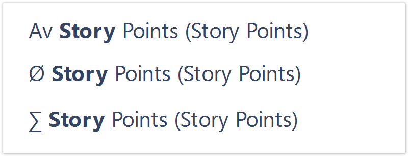
If there are multiple calculation rules for a single field, they all are selectable from the dropdown list.
The field name will be written in parentheses behind the rule name.
Select a field that will be used to group the results on the Y-axis.
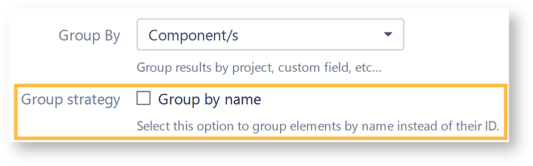
Grouping by name instead by ID
SINCE VERSION 3.6.0
When selecting one of the following fields, it is possible to group by their name instead of the ID:
Version fields (Affected version, Fix version)
Components field
Option select custom fields
By default, the values will be grouped by their ID, meaning that there might be several options that have the same name (e.g. 2 components from different projects) but since they don't have the same ID in the database, they will be treated as two different values.
When checking the checkbox, options with the same value will be treated as one option, even though they are saved as different values in the database.
 View mode
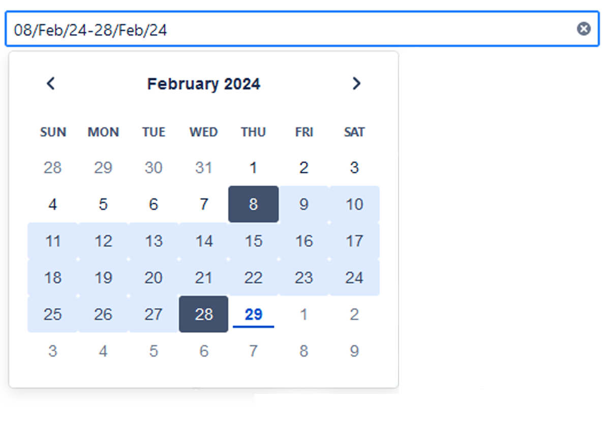
The gadget displays an additional filter at the top when a date field is selected in the configuration.

It contains the following options:
Option | Description |
|---|---|
Date filter | The drop-down menu contains the options in the following order:
Initially, it is pre-populated with the value set in the configuration and the data is displayed accordingly. |
Date picker | The picker allows you to override the "Date filter" selection. You can select the start and end dates of the aggregated data by clicking first on the start date and then on the end date.
To enter your chosen date, click next to the expanded calendar.
|
Date grouping | The selector determines how the data is grouped in the columns/rows of the table. The drop-down menu contains the following options:
Initially, it is pre-populated with the value set in the configuration and the data is displayed accordingly.
|
Info icon | The tooltip displays information about the data displayed in the gadget. |
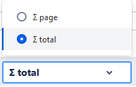
You can choose between the overall ∑ total or the total of the ∑ page. Or you can choose between the Ø total or the Ø page, if you selected average fields.
Related Use Cases
| Title | Description | Gadget |
|---|---|---|
| Comparison of Budget and Total Costs | Compare previous year's budgets and costs on a quarterly basis. | Grouped Filter Results |