Page History
| UI Text Box | ||||
|---|---|---|---|---|
| ||||
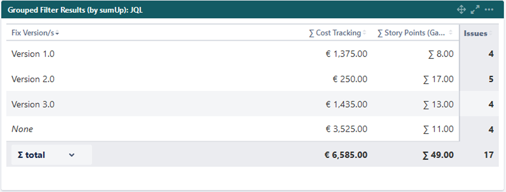
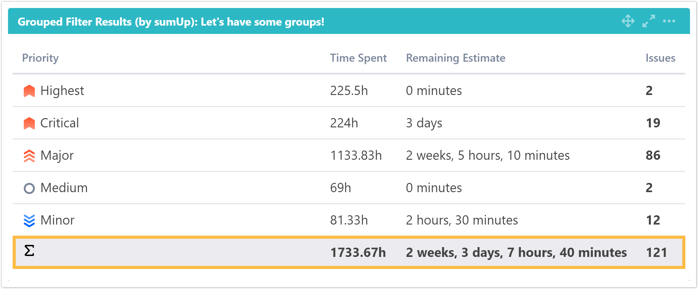
What does this gadget offer? The Grouped Filter Results gadget can be used to calculate sums of multiple fields while the source issues are grouped by one custom field. |
 Configuration
| UI Expand | ||
|---|---|---|
| ||
Add aa custom title to the gadget for easier identification. If nothing is set, the title will be generated by combining the gadget name and the selected filter/ JQL. |
| UI Expand | ||
|---|---|---|
| ||
Select whether you want to use a predefined JQL Filter or a custom JQL to get the issues. |
| UI Expand | |||||||||||||
|---|---|---|---|---|---|---|---|---|---|---|---|---|---|
| |||||||||||||
Add fields to be displayed as columns and reorder them using drag and drop.
|
| UI Expand | |||||||||||
|---|---|---|---|---|---|---|---|---|---|---|---|
| |||||||||||
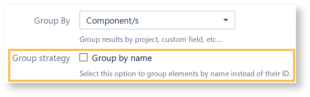
Select a field that will be used to group the results on the Y-axis.
|
| UI Expand | ||
|---|---|---|
| ||
Choose how many results you want to display on your dashboard. |
| UI Expand | |||
|---|---|---|---|
| |||
| Excerpt | |||
Option | Description | ||
Which time period do you want to display as default? | If you have chosen to group the data by a date or date time field (e.g. “Due date” or “Created”), you can set a default time period for the displayed data when the gadget is loaded or refreshed. You can choose between:
| ||
Which default for the date aggregation level do you choose | If you have chosen to group the data by a date or date time field (e.g. “Due date” or “Created”), you can set a default time period for the displayed data when the gadget is loaded or refreshed.
| ||
| UI Expand | |||
| |||
| |||
Specify how often the gadget should be refreshed. You can choose between:
Info | If Never is selected, the gadget will only be refreshed on page reload . |
 View mode
| UI Expand | |||||
|---|---|---|---|---|---|
| |||||
|
| UI Expand | |||||||||||
|---|---|---|---|---|---|---|---|---|---|---|---|
| |||||||||||
| UI Text Box | | ||||||||||
| |||||||||||
| Excerpt | |||||||||||
Option | Description | ||||||||||
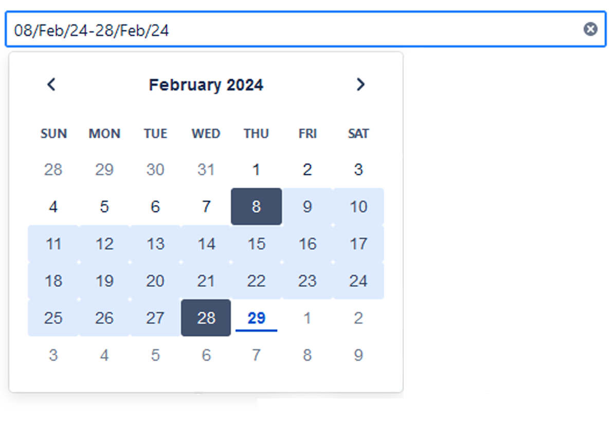
Date filter | The drop-down menu contains the options in the following order:
| Date picker | |||||||||
| UI Text Box | |||||||||||
|

| Note |
|---|
To enter your chosen date, click next to the expanded calendar. |
| UI Text Box | ||
|---|---|---|
| ||
|
Date grouping
| UI Text Box | ||
|---|---|---|
| ||
The selector determines how the data is grouped in the columns/rows of the table. |
The drop-down menu contains the following options:
- Daily shown as separate dates.
- Weekly shown as W1, W2, W3,...
- Monthly shown as M1, M2, M3,...
- Quarterly shown as Q1, Q2, Q3, Q4
- Yearly shown as Y/22, Y/23, Y/24, ...
| UI Text Box | ||
|---|---|---|
| ||
Initially, it is pre-populated with the value set in the configuration and the data is displayed accordingly. |
Info icon
The tooltip displays information about the data displayed in the gadget.
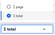
| title | ∑ total |
|---|
Related Use Cases
| Excerpt Include | ||||||
|---|---|---|---|---|---|---|
|