Versions Compared

Key

  • This line was added.
  • This line was removed.
  • Formatting was changed.


UI Text Box
sizemedium
typeinfo

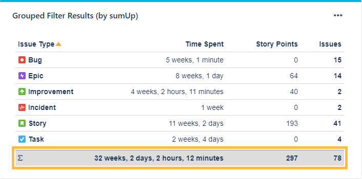
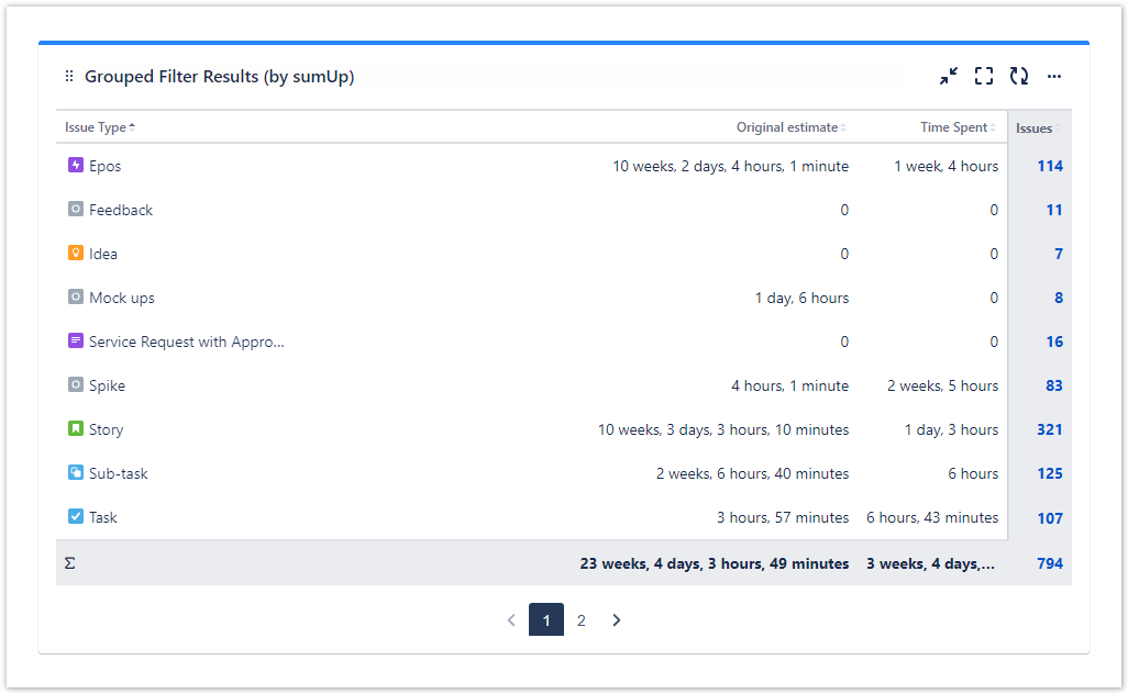
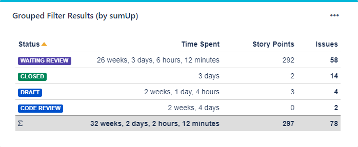
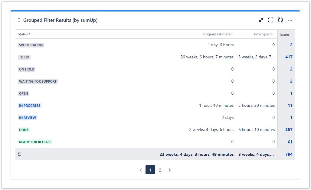
The Grouped Filter Results (by sumUp) gadget can be used to calculate calculates sums of multiple fields while the source issues are grouped by one custom field.

Image Removed

Image Added


Image RemovedImage AddedConfiguration

UI Expand
titleFilter

Select an existing filter or choose to enter custom JQL.

Which issues do you want to analyze?

Select whether you want to use a predefined JQL Filter or a custom JQL to get the issues. 

UI Expand
titleJQL

(warning) Only available if Custom JQL was selected in the Filter parameter.

UI Text Box
typetipnote

No need to create hundreds of filters to be used in various gadgets - simply define the result set by adding a custom JQL! 

UI Expand
titleColumns Which fields would you like to display?

Add fields to be displayed as columns and reorder them using drag and drop.

UI Text Box
typenote

Only certain fields can actually be summed up (e.g numeric fields, text fields with numeric values etc.) 

UI Expand
iconfalse
titleGroup byHow do you want to group the results?

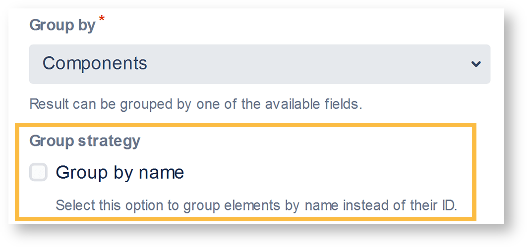
Select a field that will be used to group the results on on the y-axisAxis.

Examples:

Issue typeStatus

Image Removed

Image Removed

Image Added

Image Added

UI Expand
titleHow many rows do you want to display per page?

Choose how many results you want to display on your dashboard. 

UI Expand
titleChoose additional options
Excerpt

Optionally, you can set different additional options to change the behavior of this gadget.

Image Added

OptionDescription
Do you want to refresh your data every 15 minutes?

Check this option to refresh the results of the gadget every 15 minutes.

UI Text Box
typetip

Enabling this option is useful when displaying information that needs a periodic refresh. For example, displaying the gadget on a wallboard.


Do you want to group the elements by name instead of their ID?

This option is helpful if you wish to group the results by fields that share the same name or the options. For example, if you have a fix version named "EAP_Q2" across multiple projects, checking this option will ensure the results will be grouped under the same name instead of showing them as separate entries.

UI Text Box
typenote
Excerpt

Grouping by name instead by ID

When selecting one of the following fields, it is possible to group by their option names instead of their IDs:

  • Components field
  • Option select custom fields
    • By default, all values will be grouped by their ID, meaning that fields or options that share a common name

    (e.g. two components named 'Backend' from two different projects)
    • will be treated as two different values,

     since
    • since they don't have the same ID in the database.
      When checking the checkbox , options with the same option name will be treated as one option , even though they are saved as different values in the database.

    Image Removed

    UI Expand
    titleNumber of results

    Choose how many results you want to display on your dashboard.

    UI Expand
    titleAuto refresh
    Check this option to refresh the results of the gadget every 15 minutes. Useful when displaying information on a wallboard.

    • This option is not available for all the fields. It is only available on selecting the certain fields in "Group by" section that could share same name or options. Some of the fields where this option is applicable are:
      • Versions
      • Components
      • Issue type
      • Severity
      • Sprint
      • Status
      • Option-based fields


    Do you want to include links to show results in the issue navigator?

    If you are someone who likes seeing the issues behind numeric entries on the gadget, this option is your match. With this option checked, you are taken to the Issue navigator page every time you click on a numeric entry on the sumUp gadget. Once you are on the Issue navigator page, you can see the JQL (and subsequently the issues) that accounts for the numeric entry displayed on gadget.

    Include Page
    DECADIS:SumUpCloud_JQL
    DECADIS:SumUpCloud_JQL

    UI Text Box
    typetip

    If you do not usually go to the Issue navigator or if the loading time for your gadget is too high, leave the option unchecked.

    Which time period do you want to display as default?

    If you have chosen to group the data by a date or date time field (e.g. Due date or Created), you can set a default time period for the displayed data when the gadget is loaded or refreshed.

    You can choose between: 

    • Current week
    • Current month
    • Current quarter
    • Current year
    • All-time
    Which default date aggregation level do you choose?

    If you have chosen to group the data by a date or date time field (e.g. Due date or Created), you can set a default aggregation level for the displayed data when the gadget is loaded or refreshed.

    You can choose between: 

    • Daily
    • Weekly
    • Monthly
    • Quarterly
    • Yearly


    Image AddedView mode

    UI Expand
    titleSorting
    Note
    titleSorting

    The colums can be sorted by clicking on the small arrows next to each colum header. 

    UI Expand
    titleFilter bar
    UI Text Box
    typenote

    The gadget displays an additional filter at the top when a date field is selected in the configuration.

    Initially, it is pre-populated with the value set in the configuration and the data is displayed accordingly. 

    Image Added


    Excerpt
    OptionDescription
    Time period

    The drop-down menu contains the options in the following order:

    • Current week
    • Current month
    • Current quarter
    • Current year
    • All-time
    Date picker
    UI Text Box
    typetip

    The picker allows you to override the Time period selection.

    You can select the start and end dates of the aggregated data by clicking first on the start date and then on the end date.

    Image Added

    Info

    To enter your chosen date, click next to the expanded calendar.

    UI Text Box
    typenote

    If the date range is not customized, it reflects the chosen Time period. For example, the period selection would display 01/Jan/24-31/Dec/2024 if the Current year option is selected. If the date range is adjusted, the Date Filter View changes to Customized.

    Date grouping
    UI Text Box
    typetip

    The selector determines how the data is grouped in the columns/rows of the table.

    The drop-down menu contains the following options:

    • Daily shown as separate dates. 
    • Weekly shown as W1, W2, W3,...
    • Monthly shown as M1, M2, M3,...
    • Quarterly shown as Q1, Q2, Q3, Q4
    • Yearly shown as Y/22, Y/23, Y/24, ...

    If the data spans more than one year, the Weekly, Monthly and Quarterly data are shown with the year as suffix, e.g. Q1/24.

    Info icon

    The tooltip displays information about the data displayed in the gadget.


    Image AddedUse cases and examples 

    Page properties report
    firstcolumnUse case
    headingsDescription, Gadget
    cqllabel = "grouped-filter-resuls" and space = currentSpace()


    Excerpt Include
    DECADIS:Contact support
    DECADIS:Contact support
    nopaneltrue